Creating a Solution to a Nationwide Medical Problem
Company
Cowbell Cyber, Inc.
Industry
Cyber Insurance
Duration
6 week sprint, 2023
Date
January 2023
Overview
RouteMyRx is the be-all end-all hub for obtaining prescriptions, presenting patients clear options for picking up or ordering prescription deliveries within a matter of seconds. For 3 weeks of the beginning of 2021, I had the pleasure of working on an interesting usability-centered product idea for and with VendRx, primarily a prescription vending company now looking to expand their services.
The Nationwide Problem
On kick-off, the VendRx team brought to our attention a staggering data point - 1 out of 3 new prescriptions get abandoned, up to 50% abandoned in emergency rooms. According to Phrma, this statistic accounts for $213 billion in U.S. health care costs annually, an incredulous "8% of the nation’s health care costs”.
To address this issue, the VendRx team originated a novel solution - to become the link between patients, who needed their prescriptions but don’t have medical or insurance know-how, and pharmacies, who have prescriptions being abandoned at an enormous rate. However, there was no research done or physical design completed on this idea. Through this design process, my team and I investigated how real patients and users think, feel, and act in the context of medicine.
User Research
We started our research off by conducting 6 user interviews and surveying 13 people who take prescriptions regularly. Topics included methods of obtaining prescriptions, managing prescriptions, and asking about pricing of their medication. We found that all users found insurance, especially regarding prescriptions, confusing and out of their comfort zone. What we found surprising was that users had different and varying values when it came to convenience, some saying that they would prefer going to their frequented grocery store, even if a different pharmacy was closer or had their prescription for cheaper.
Synthesis
🔎 Insights:
Users that abandoned prescriptions mostly did it out of inconvenience in schedule.
Some users prefer to get prescriptions delivered, while others would rather pick up their prescription due to the type of medication.
Don’t make a stand-alone app - users don’t want to download something new.
❗Pain Points:
Insurance policies, especially regarding prescriptions, is confusing to most users.
Lots of users have a mental block when it comes to anything medical related, and do not want anything to deal with it.
Some users think of going to the pharmacy as a pain, akin to taking out the trash.
Most users run errands in tandem, like going grocery shopping and picking up their prescription at the same time.
Competitor & Comparator Analysis
In addition to our user research, we conducted C&C Analysis to better understand our solution’s main competitors and comparators. However, because our solution was quite novel, we couldn’t find any direct competitors; rather, we found lots of comparator companies which offered some parts of our solution and not others. For example, we found some prescription delivery apps and some prescription vending services, but none that showed patients all their options and directed them accordingly.
Persona
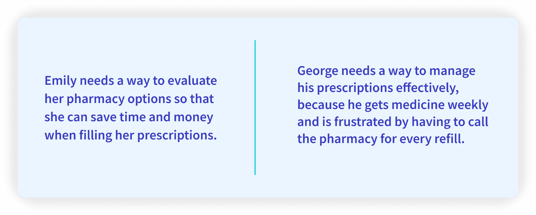
Our research led us to creating two personas; Emily, who’s had a rough year thanks to the pandemic and got prescribed anxiety medication, and George, who’s had chronic back pain and needs a reliable way to get refills without needing to leave home. Emily’s in a similar boat as she doesn’t want to leave home because of the pandemic, but wants a way to compare prescription and delivery prices easily.
Problem and Solution Statements
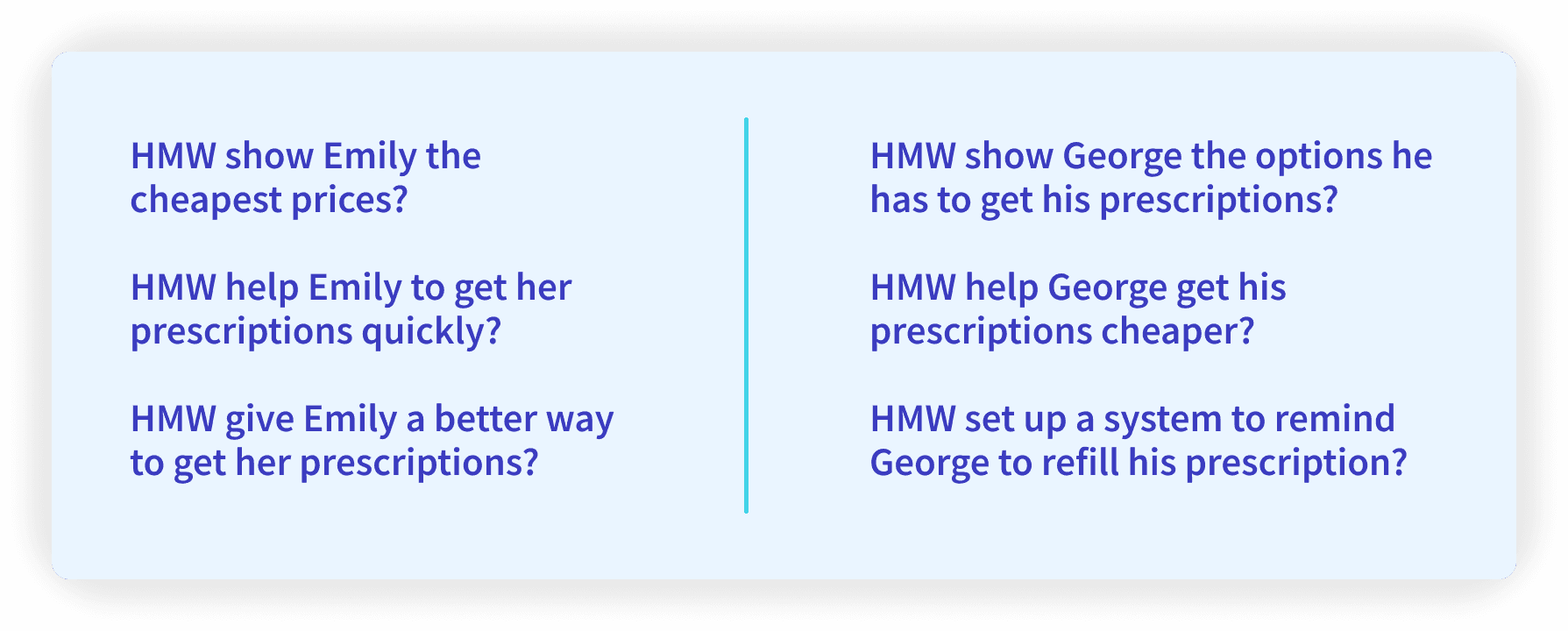
To solve for Emily and George’s needs, we created Problem Statements and How Might We (HMW) to further synthesize our research and start brainstorming our solutions. us to creating two personas; Emily, who’s had a rough year thanks to the pandemic and got prescribed anxiety medication, and George, who’s had chronic back pain and needs a reliable way to get refills without needing to leave home. Emily’s in a similar boat as she doesn’t want to leave home because of the pandemic, but wants a way to compare prescription and delivery prices easily.
User Flow
Using our problem statements and HMW statements, we revised the user flow that the VendRx team had shared with us. It looks very confusing and lengthy, but is quite straightforward, with the user having 5 ways to obtain medication.
Sketches and Wireframes
Usability Testing
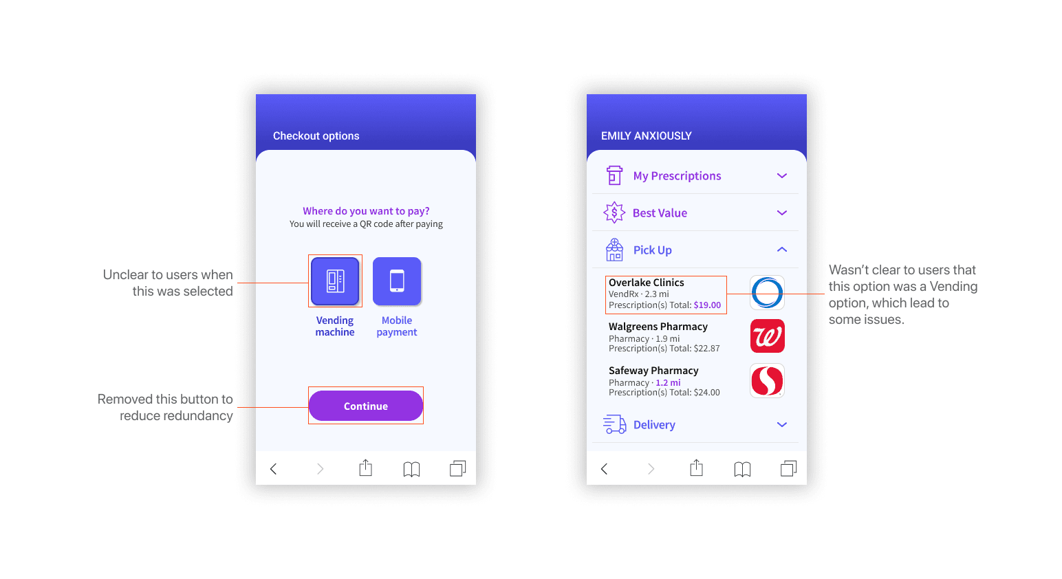
Using our mid-fidelity wireframes, we conducted 5 usability tests to find problems in our flow and screens. From these tests, we gathered helpful insights, like how picking up prescription and getting prescription from a vending machine seemed quite similar, or general confusion about what coupons did.
Moodboard
To come up with a color palette for our design, we created a moodboard that fit the professional yet friendly vibe of healthcare, along with the colorful arrangement of pills. Blues and off-whites would be used for our main colors with purple as accents, and we saved harsh oranges for errors. For iconography, we chose simple line icons that conveyed ideas easily.
Design System
For this project, I implemented the use of an atomic design system, which was immensely helpful for prototyping and linking things together in preparation for usability testing. Additionally, when going through iterations of our design, we found the system useful in quickly updating our current designs with ideas and changes.
High Fidelity Design and Interactions
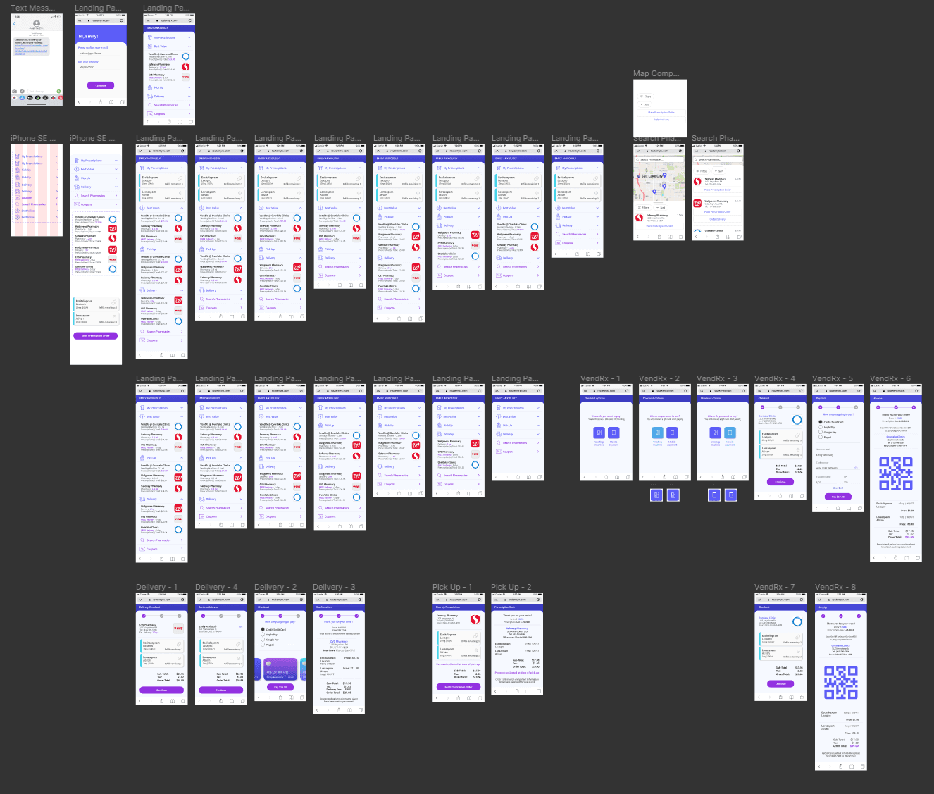
For this project, I took initiative as the Head Interaction and UX Designer, which involved me specifically focusing my attention on the high fidelity screens, what information would be shown to the user, what the user could interact with, how those interactions would look like, and so on. An iPhone SE was chosen, as almost all of our users from user interviews used iPhone SE’s.


For high fidelity, I created simple drop-down menus for each ordering option. Some micro-interactions I worked extensively on were the sliding animations of items in a menu, certain click interactions, and so on. The prescription information cards were kept from before, omitting the managing prescription function, as there were certain legal hurdles that we couldn’t jump.
High Fidelity Prototype
Hi-Fi Usability Testing
While there were some usability issues with our prototype, like confusion in a specific part of the flow, we gathered a exceedingly warm reception to our design, most stating that they liked the simplicity of the design, and that they would consider using the product in the future.
Final Solution & Thoughts
The biggest challenge that I faced during this project was communication with the client. Because our client was quite busy during this 3 week process, we didn't have any chances to meet virtually and talk about the work that we had done, which is my preferred method of communication. I had to learn to settle with back and forth emails with the client to convey information, findings, and iterations of work that we did. In the future, I'd like to hash out and solidify the method of communication between all stakeholders of a project.Overall, however, I couldn’t ask for a better group dynamic, as we seemed to all focus on what we were happy doing in the design process, and I found myself prototyping the entirety of the mid/high fidelity prototype, which I volunteered to do. I look forward to the future, where I can collaborate and work together with great designers again.


