Overview
Cowbell Cyber is a cyber insurance startup that, in addition to providing cyber insurance policies to small to medium sized companies, helps policyholders better understand their cyber security posture and mitigate risk by breaking down their risk into separate metrics.
One of my large projects as a UI/UX Designer on the Internal Operations Team (IO Team) was a cross-functional project, designing a new workflow with a number of new features to help internal cyber security experts seamlessly assist and improve policyholder cyber posture within the Cowbell Platform.
Understanding the role of Risk Engineering
Risk Engineers at Cowbell are a team of cyber security subject-matter experts with the goal of educating cyber insurance policy holders and illuminating any existing risks or vulnerabilities policy holders might have. As the Risk Engineering team began to scale, the need for an in-house workflow grew. During my time at Cowbell Cyber, I led and designed the end-to-end flow for the Risk Engineering Inbox and relevant workflows/features.
After initial conversations, shadowing sessions, and user profile interviews, I identified 3 bottlenecks that our Risk Engineers were suffering through:
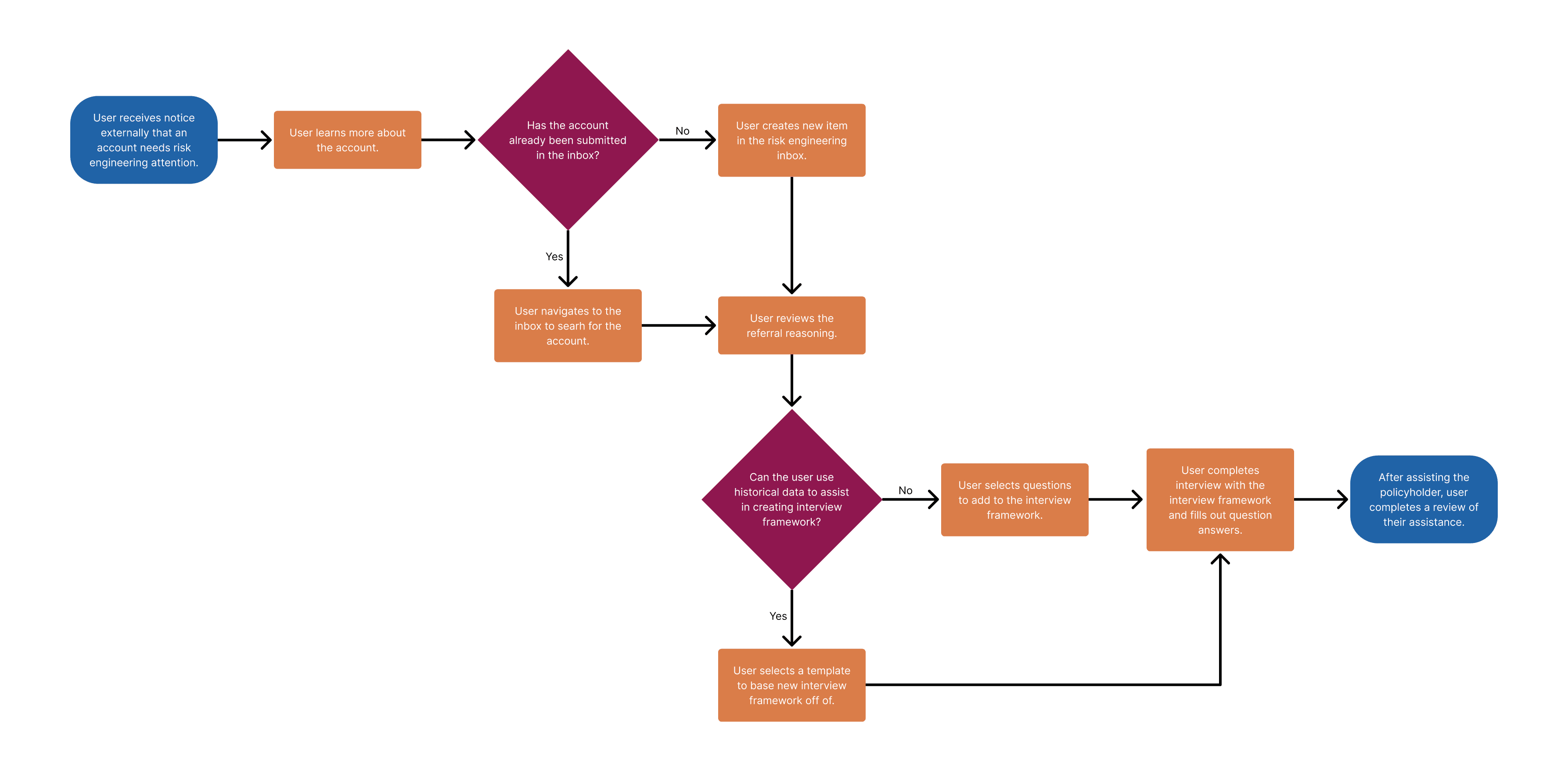
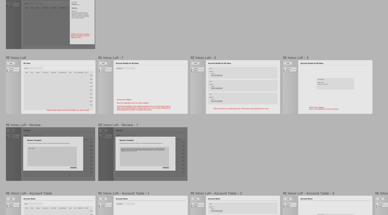
To have more informative conversations with stakeholders, I created user flows and low fidelity mockups and iterated based on the outcomes of those meetings.
Solving for Risk Engineering’s 3 Bottlenecks
To solve for my three main pain points, my design solutions were the following:
Communication 💬
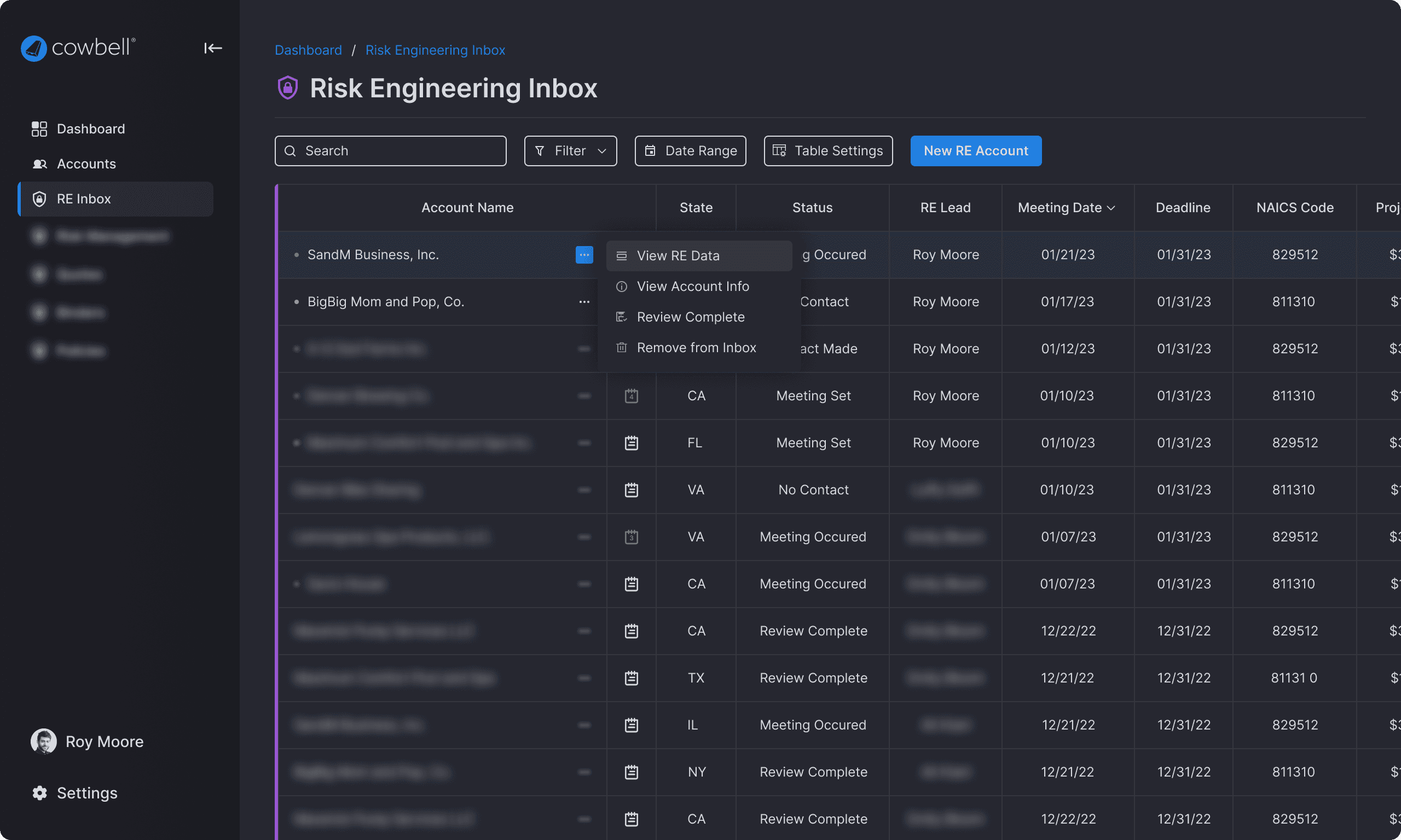
I created a dashboard for risk engineers and relevant internal users - each item in the dashboard table has needed information and associated notes for internal users to share updates and working notes.
Data Ingestion 💻
The table aggregates user and auto-generated accounts needing risk engineering attention. Additionally, users can search the dashboard table to access historical data to reference.
Documentation 📄
All working notes and referrals are stored in the table and in each individual account’s details and notes.
Usability and Interactions
During the developing phase of my design process, I iterated on different visual treatments for the best usability.
Selecting the right questions
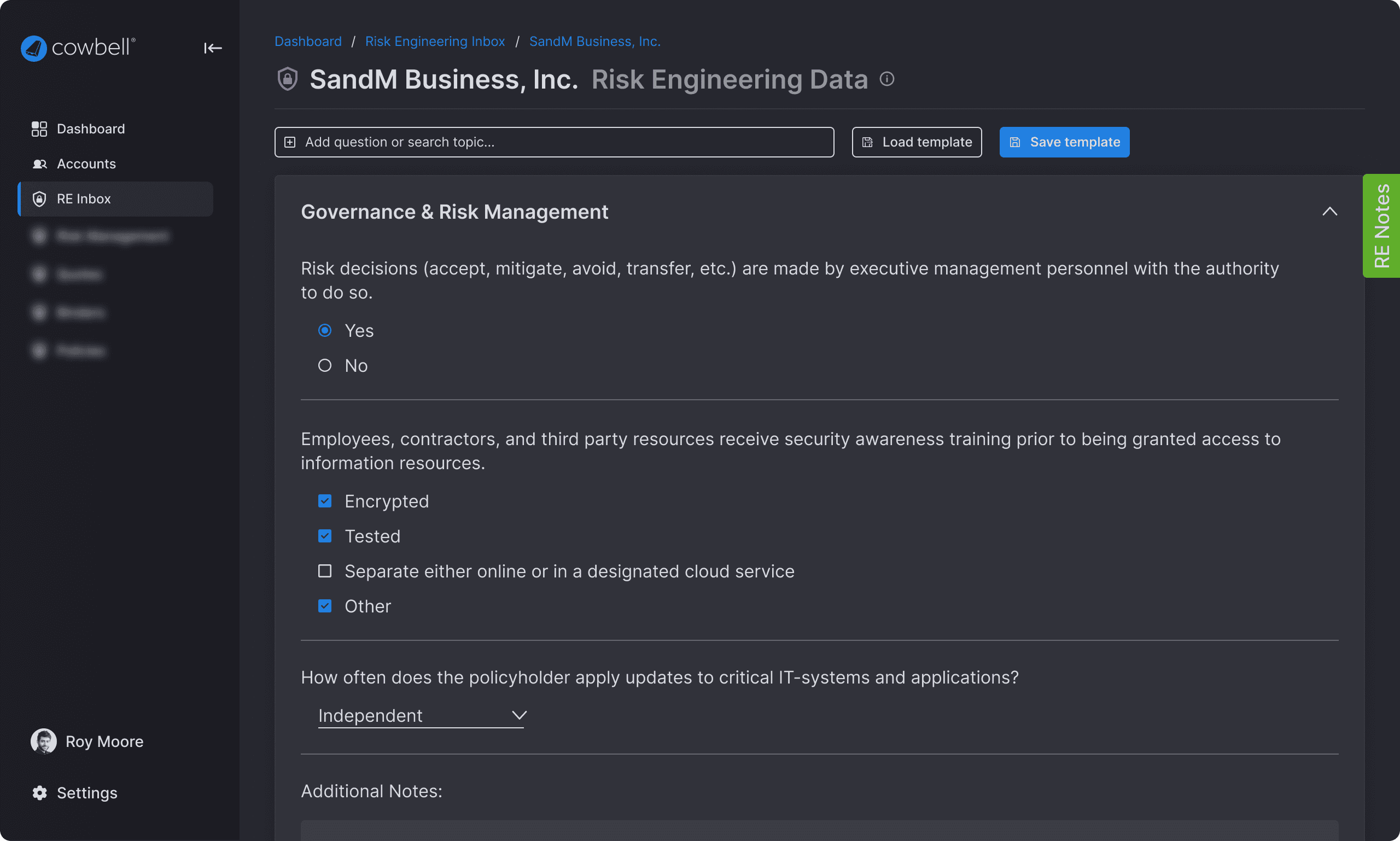
During discovery, I found that risk engineering may ask questions that may result in different answer types (yes/no vs. yes/no/other). A way to visually differentiate between same question/different answer selection choices became apparent.
Managing Templates
The user can quickly see the most relevant information about a template to select the correct one. This design was the final iteration after a result of scoping down engineering effort and usability testing with the user.
Detailed Interactions
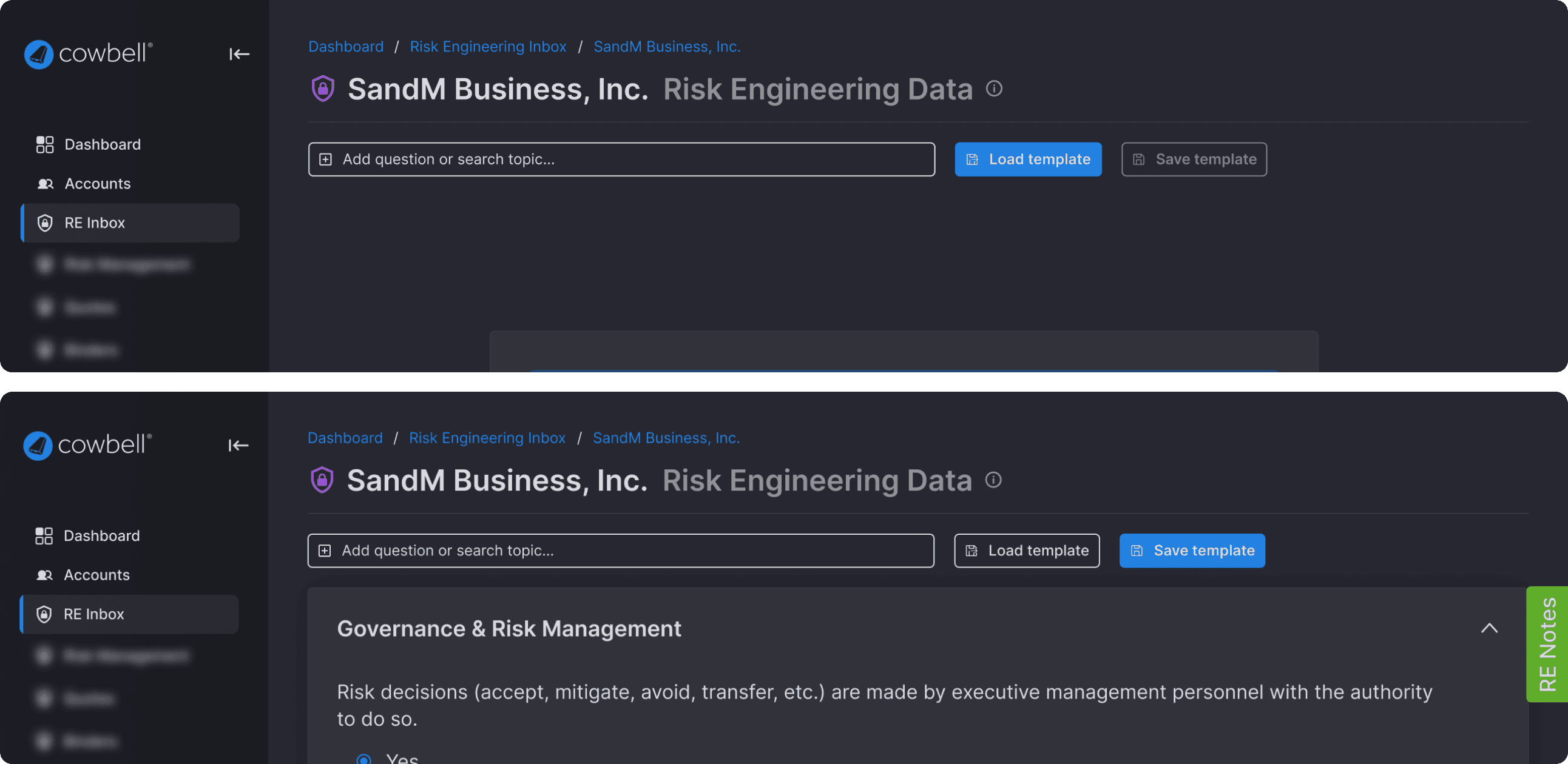
If the user is starting from a blank slate, loading a template would be the most usable button. When either a template is loaded or the user has manually added a set of questions, saving the form as a template would be the most usable button.
Final Solution & Thoughts
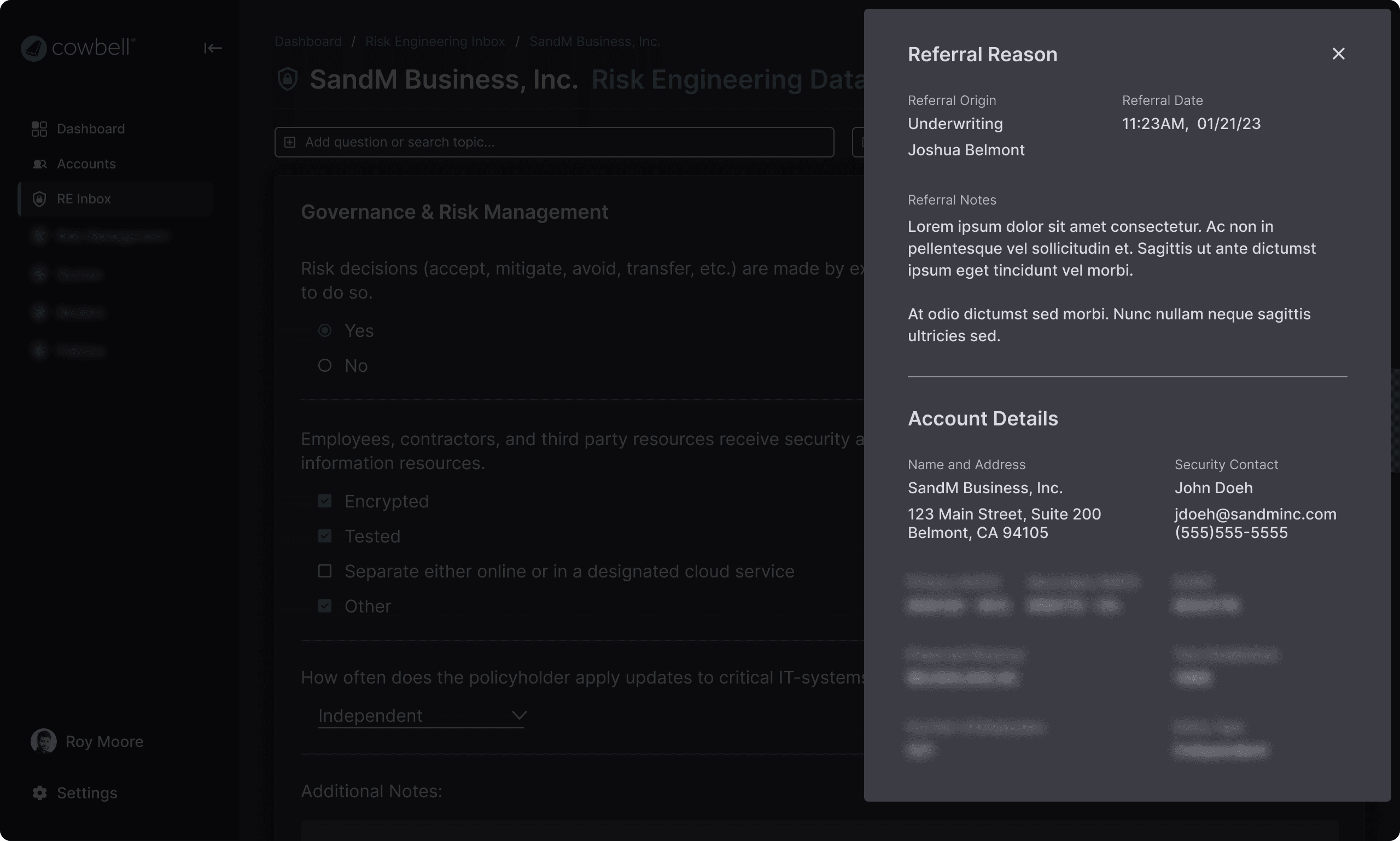
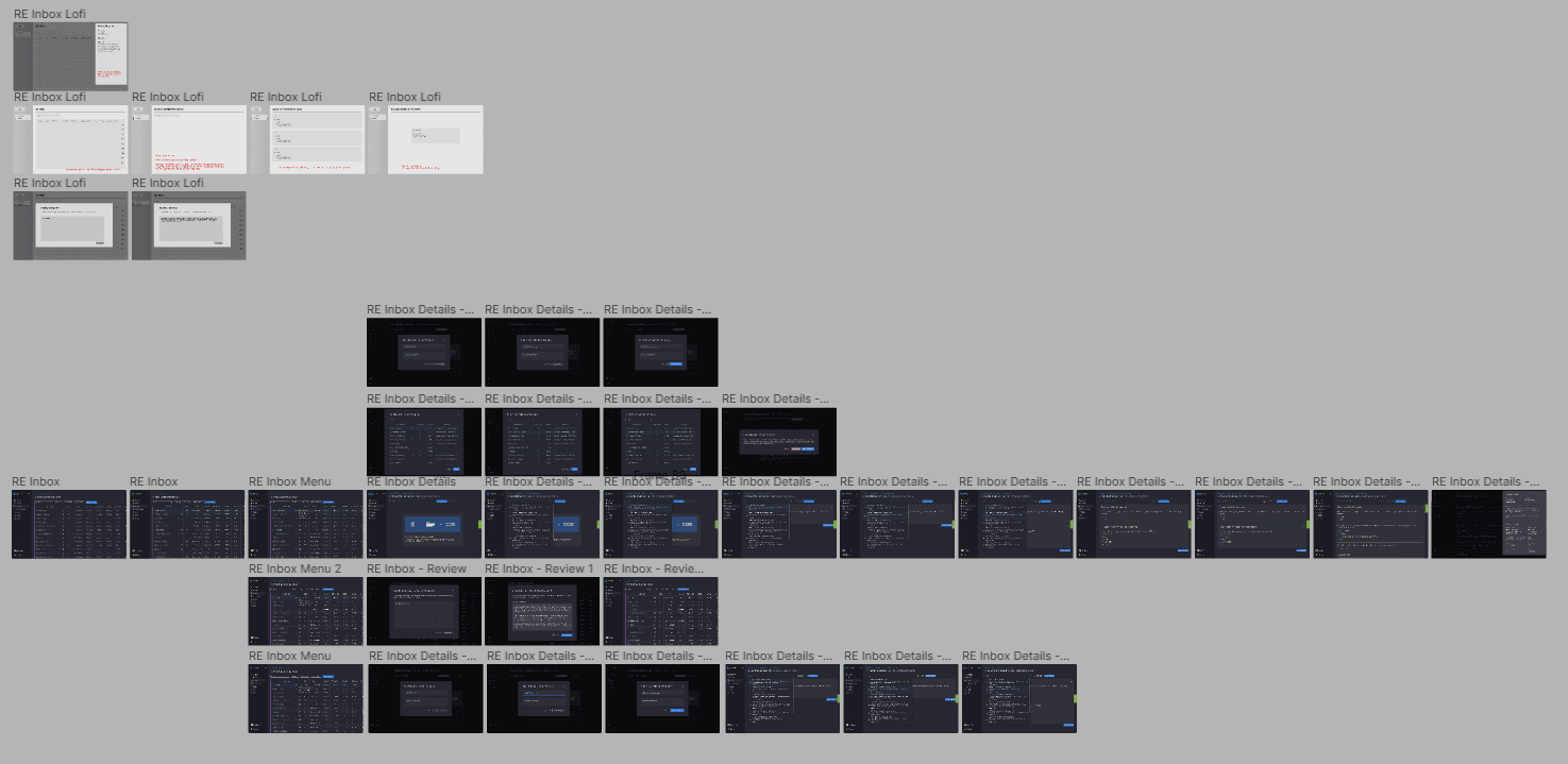
The final designs include the end-to-end lifecycle of an account in a risk engineer’s hands. This flow includes reviewing notes by other internal parties (like underwriting or sales), creating a new item in the table, loading and saving templates, and completing interviews.
Next Steps & Learnings
The screens above were handed off to engineering for implementation. After conducting follow-up interviews, I found that the workflow was a success with users and was integral to improving productivity and reducing bottlenecks.
Redesigns wouldn’t be required for the foreseeable future, but future iterations are needed for creating an AI-driven workflow with auto-generated items with critical vulnerabilities needing immediate attention, or even an auto-generated template, given account parameters.
Throughout this process, I worked closely with product and engineering which helped greatly in driving usability and feasible design. Additionally, speaking with members of c-suite and understanding the business goals of this project improved my prioritization and design thinking.

